From abstract to concrete
A UX/UI Case
Here I’ll use a classic example to show my product design process and what I can do for you. I’ve chosen a newsletter signup page for this because they are straightforward at their most basic and almost everyone has signed up for and received a newsletter in their time as an internet user.
1. What are we trying to achieve and why?
Questions, questions
Products can often get bogged down in what could be. I like to start with why.
What is your organization trying to achieve? A business justification is as essential to product design as it is to your organisation; how will this product reduce costs, generate revenue, make your organisation more efficient, improve your staff’s quality of life, and/or uphold your organisation’s ethos?
Who is this for? Your users, audience members, beneficiaries, customers, clients, donors, listeners, and readers all have something they’re trying to do. How will this product make their endeavour easier and more successful?
Build for your users’ goals, build for your organization’s goals, and you have a valuable long-lasting product.
UX Case:
Maclean’s is one of Canada’s largest news publications. The Maclean’s team aims to keep Canada informed through rigorous journalism. In this case, we’re trying to convert more readers of Maclean’s online content into newsletter subscribers. Newsletter subscribers are valuable for brand awareness, engagement, marketing, and advertising revenue. Newsletters let users engage directly with the journalism that interests them and keep them up to date with current commentary and events.
2. What do we need to achieve this?
Foundations: content, design, and development.
Pillars: technology, user experience (UX), and the product’s inherent value.
Ornamentation: aesthetics, branding, and peripheral features.
Key Benchmarks: exceed the standard of product quality and functionality, build for versatility and ease of revision, and reduce technical debt, complexity, and maintenance costs.
UX Case:
Maclean’s has a site, a Content Management System (CMS), and a newsletter platform. The newsletter signup page needs copy and images that communicate the value of Maclean’s newsletters to a reader, technology that collects and protects their information and preferences, and UX that makes signing up quick, easy, informative and accessible to all.
3. How should it work?
Whether you have your own UI designers, UX researchers, and insights or you need a hand, I’ll work with whatever we have to ensure each function and component is accounted for in the user flow and is implemented to its greatest effect.
UX Case:
Maclean’s has a lot of insights about its readership. The signup page needs structure to showcase what Maclean’s can offer to an audience that wants the facts and to make informed choices efficiently.
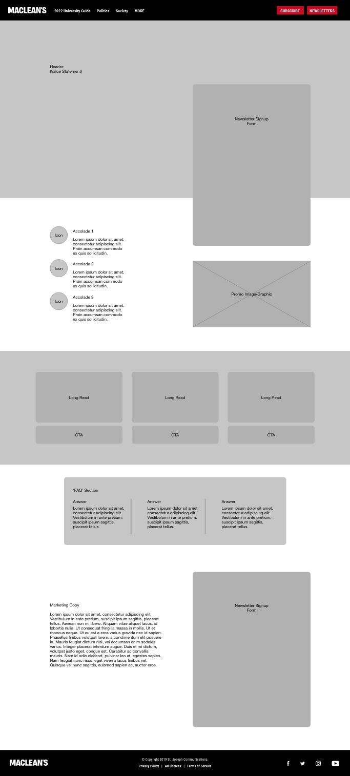
The form is the most important component and should be immediately obvious and accessible to the reader; there’s no need to persuade a reader who has already come to the page with the intent to sign up. For the unconverted, a value statement is most important with support from endorsements and high value samples of content. For the still hesitant reader, an FAQ section works in tandem with the form at the base of the page to provide transparency and address privacy concerns without obstructing a committed reader with them.
The visual hierarchy is clear and concise and each structural element is positioned to flow into the next, encouraging the user to move between them. The remaining ‘whitespace’ reduces visual clutter and select areas are available for assets and branding.

4. What should it look like?
The page should have an attractive, easy to navigate layout that gives users feedback and gets them from A to B while building trust by embodying your brand identity.
UI mocks are more than just a blueprint - they’re typically interactive and contain essential information for your developer(s) on how the product should behave. More than just aesthetics, this ensures functionality, accessibility, and legal compliance from the start of your product’s life.
UX Case:
With the wireframe structure in place the mocks are intended to provide a much higher fidelity representation of what Maclean’s newsletter signup page will look like.
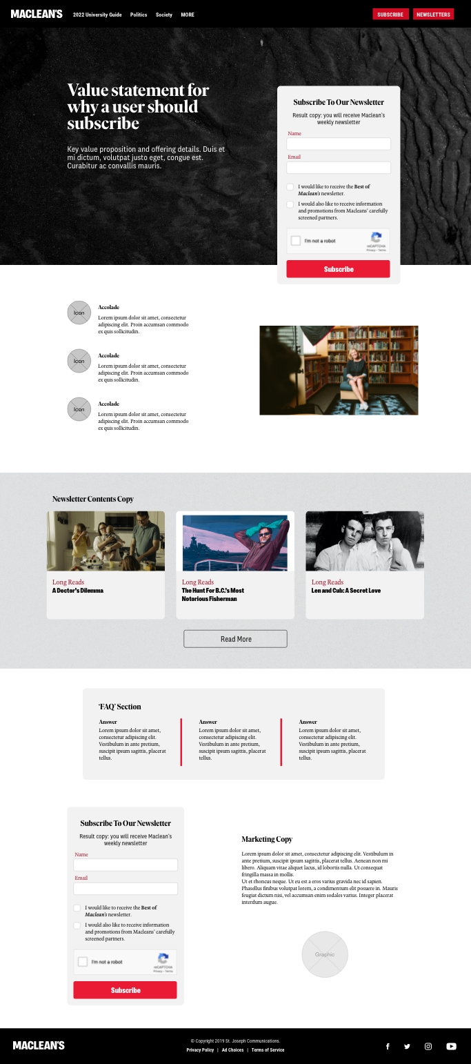
The mock includes all the basic design ingredients, i.e. assets, copy, brand colours, and brand typography. It also emphasizes the wireframe’s structure with strong visual hierarchy, neutral backgrounds, and contrast between elements. Extraneous cognitive load is reduced by simplifying graphic elements and making intentional use of colour that draws the reader to the most important aspects of the page. Elements, such as the ‘Newsletter Content’ articles, also match styles seen elsewhere on Maclean’s site making use of the reader’s familiarity with the brand; this capitalizes on the trust that is already associated with the Maclean’s brand identity.
Among other technical information, the mocks also account for legal text and requirements, anti-spam measures, and accessibility standards; take for example, the mock’s colours and the signup form fields. The mock contains colour codes that have verified contrast ratios so that any text on the page is legible to partially sighted individuals. The signup form only asks for essential information which reduces Maclean’s legal liability in the event of a data leak or the workload in the event of a privacy request.

5. Does it work? Does it look good?
Depending on your project, design quality assurance (QA) can happen at several different stages. In a typical workflow I like to review most products when mocks are first completed, before it goes to development, and again before the product goes live. This ensures that user acceptance testing (UAT) is focused on the user and no time is wasted.
Simply put, QA is essential and ensures that the product works as designed.
UX Case:
The newsletter page is accessible, collects no more and no less information than is needed, and lets readers reach their goal with minimal friction and complexity. By using pre-existing technology in the CMS and the newsletter platform overhead costs and tech debt are unchanged. The page matches the branding and design requirements seen in the mocks on desktop, tablet, and mobile devices.
Over the following weeks at Maclean’s a substantial improvement in reader signups from multiple points across the site can be seen, meeting the original goal.
6. What did we learn?
As a team, our UX research and implementation was successful. The project met the original goal but what were our blindspots? Where are there opportunities for the product to grow?
UX Case:
From data to analytics to insights, Maclean’s web team discovers:
The signup form at the bottom of the page is getting more conversions than the one at the top. Analytics provides the insight that this is because the value and trust statements within the page are successful. Is there a way these statements can be communicated to readers elsewhere on the site and garner more signups on the initial form?
Due to the volume of site visitors the reCAPTCHA anti-spam measure in the signup form is glitching for some readers, as reCAPTCHA is a third-party service it’s a difficult error to address. It isn’t a great user experience and one of our UAT testers has pointed out that reCAPTCHA isn’t as accessibility friendly as it could be. Is there another anti-spam system, such as the honeypot method, that would work better?
I’ve touched lightly on the subject of signup forms here. Bigger digital products can involve competitive analysis, user interviews, MVAs and MVPs, empathy, journey, and site maps, tasks flows, and fresh branding; to chat more about the unique UX complexities of digital forms (or otherwise), get in touch →